通用标签组件,支持实心标签、空心标签、特殊标签、图片标签
效果
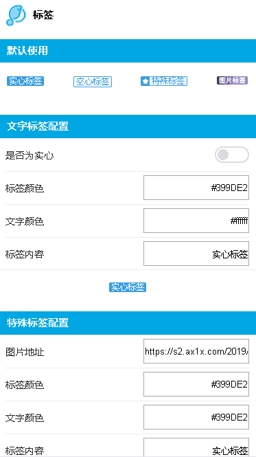
使用方法
<template>
  <div class="wxc-demo">
      <lc-title title="标签"></lc-title>
      <category title="默认使用"></category>
      <div class="tag-list">
        <lc-tag v-for="(item,index) in demoData"
                :key="index"
                v-bind="item"></lc-tag>
      </div>

      <category title="文字标签配置"></category>
      <div class="sub-demo">
        <lc-cell title="是否为空心">
            <lc-switch slot="desc" @change="type= type==='solid' ?'hollow' : 'solid'"></lc-switch>
        </lc-cell>

        <lc-cell title="标签颜色">
            <input class="input" slot="desc"
                    placeholder="请输入标签色值"
                    v-model="tagColor" />
        </lc-cell>
        <lc-cell title="文字颜色">
            <input class="input" slot="desc"
                    placeholder="请输入文字色值"
                    v-model="fontColor" />
            </lc-cell>
        <lc-cell title="标签内容">
            <input class="input" slot="desc"
                    placeholder="请输入tag文字内容"
                    v-model="value" />
        </lc-cell>
        <div class="demo1">
            <lc-tag :type="type"
                :tag-color="tagColor"
                :font-color="fontColor"
                v-model="value"></lc-tag>
        </div>
      </div>

      <category title="特殊标签配置"></category>
      <div class="sub-demo">
        <lc-cell title="图片地址">
            <input class="input" slot="desc"
                    placeholder="请输入tag图片地址"
                    v-model="specialIcon" />
        </lc-cell>
        <lc-cell title="标签颜色">
            <input class="input" slot="desc"
                    placeholder="请输入标签色值"
                    v-model="tagColor1" />
        </lc-cell>
        <lc-cell title="文字颜色">
            <input class="input" slot="desc"
                    placeholder="请输入文字色值"
                    v-model="fontColor1" />
        </lc-cell>
        <lc-cell title="标签内容">
            <input class="input" slot="desc"
                    placeholder="请输入tag文字内容"
                    v-model="value1" />
        </lc-cell>
        <div class="demo1">
            <lc-tag type="special"
                    :specialIcon="specialIcon"
                    :tag-color="tagColor1"
                    :font-color="fontColor1"
                    v-model="value1"></lc-tag>
        </div>
      </div>

      <category title="图片标签配置"></category>
      <div class="sub-demo">
        <lc-cell title="标签内容">
            <input class="input" slot="desc"
                    placeholder="请输入tag图片链接"
                    v-model="img" />
        </lc-cell>
        <div class="demo1">
            <lc-tag type="image" :img="img"></lc-tag>
        </div>
      </div>
  </div>
</template>

<style scoped>
  .tag-list {
    display: flex;
    flex-direction: row;
    justify-content: space-between;
    padding: 20px 12px 30px 12px;
  }
  .wxc-demo {
    background-color: #fff;
  }

  .scroller {
    display: flex;
    flex: 1;
  }
  .input {
    width: 150px;
    height: 32px;
    text-align: right;
  }

  .demo1 {
    display: flex;
    align-items: center;
    justify-content: center;
    height: 50px;
    margin-bottom: 10px;
  }


</style>

<script>
import Data from 'tag-data'
import LcTitle from '_mods/title.vue';
import Category from '_mods/category.vue';
export default {
	components: { LcTitle, Category },
    data: () => ({
      demoData:Data,
      type: 'solid',
      tagColor: '#399DE2',
      fontColor: '#ffffff',
      value: '实心标签',
      img: 'https://s2.ax1x.com/2019/12/10/Q077AP.png',
      specialIcon: 'https://s2.ax1x.com/2019/12/10/Q07Htf.png',
      tagColor1: '#399DE2',
      fontColor1: '#399DE2',
      value1: '空心标签'
    })
  }
</script>
|
可配置参数
| Prop |
Type |
Required |
Default |
Description |
| type |
String |
N |
solid |
标签的类型 *注1 |
| value |
String |
Y |
- |
文字标签的文案 |
| tag-color |
String |
N |
#ff5000 |
标签颜色 |
| font-color |
String |
N |
#ffffff |
文字颜色 |
| special-icon |
String |
N |
- |
特殊标签的小icon的图片地址 *注2 |
| img |
String |
N |
- |
图片类型tag的图片地址 *注3 |
- 注1: type的类型有如下四种solid、hollow、special、image,默认是solid(实心)
- 注2: special-icon直接使用png会更方便
- 注3: type为image时,img字段为必传