页签组,多用于tab切换的头部组件
效果
使用方法
<template>
<div>
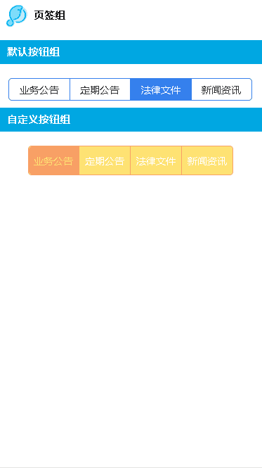
<lc-title title="页签组"></lc-title>
<category title="默认按钮组"></category>
<lc-tab-group :groups="groups" @changeTab="clickGroup" :tabIndex="2" style="margin-top:20px;"></lc-tab-group>
<category title="自定义按钮组"></category>
<lc-tab-group :groups="groups" :tabStyles="tabStyles" style="margin-top:20px;"></lc-tab-group>
</div>
</template>
<script>
import LcTitle from '_mods/title.vue';
import Category from '_mods/category.vue';
export default {
components: { LcTitle, Category },
data(){
return {
groups:[
{ text: "业务公告" },
{ text: "定期公告" },
{ text: "法律文件" },
{ text: "新闻资讯" }
],
tabStyles:{
width: 290,
height: 40,
fontSize:14,
titleColor:'#ffffff',
activeColor:'#FFE273',
borderColor:'#f8a065',
}
}
},
methods:{
clickGroup(index){
console.log(index)
}
}
}
</script>
<style scoped>
</style>
|
可配置参数
| Prop |
Type |
Required |
Default |
Description |
| groups |
Array |
Y |
|
页签组内容 |
| tabIndex |
Number |
N |
0 |
默认选择第几个 |
| tabStyles |
Object |
N |
|
自定义样式 (注1) |
注1: tabStyles
tabStyles:{
    width: 580,
    height: 80,
    fontSize:28,
    titleColor:'#f32e2e', //默认文字颜色
    activeColor:'#f3e62e',//默认背景色 选中颜色
    borderColor:'#f37d2e',//边框颜色 选中背景色
}
|
事件回调