<template>
<div class="lc-demo">
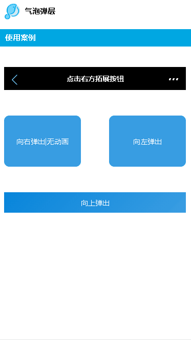
<lc-title title="气泡弹层"></lc-title>
<category title="使用案例"></category>
<div style="padding: 10px;">
<div class="demo1">
<lc-navbar @on-click-more="minibarRightButtonClick" class="navstyle">点击右方拓展按钮</lc-navbar>
</div>
<div class="demo0 demo3">
<div @click="LcButtonClicked3" class="btn">向右弹出|无动画</div>
<div @click="LcButtonClicked4" class="btn">向左弹出</div>
</div>
<div class="demo0 demo2">
<lc-button @click="LcButtonClicked2">向上弹出</lc-button>
</div>
<lc-popover ref="lc-popover1"
:buttons="btns"
:position="popoverPosition"
:arrowPosition="popoverArrowPosition"
@LcPopoverButtonClicked="popoverButtonClicked"
></lc-popover>
<lc-popover ref="lc-popover2"
:buttons="btns2"
:position="popoverPosition2"
:arrowPosition="popoverArrowPosition2"
@LcPopoverButtonClicked="popoverButtonClicked"
></lc-popover>
<lc-popover ref="lc-popover3"
:buttons="btns3"
:position="popoverPosition3"
:hasAnimation="false"
:opacity="0.4"
:arrowPosition="popoverArrowPosition3"
@LcPopoverButtonClicked="popoverButtonClicked"
></lc-popover>
<lc-popover ref="lc-popover4"
:buttons="btns4"
:position="popoverPosition4"
:arrowPosition="popoverArrowPosition4"
@LcPopoverButtonClicked="popoverButtonClicked"
></lc-popover>
</div>
</div>
</template>
<style scoped>
.lc-demo {
background-color: #FFFFFF;
}
.scroller{height: 500px;}
.demo0 {
display: flex;
width: 100%;
padding-top: 30px;
align-items: center;
flex-direction: row;
justify-content: space-between;
}
.demo1 {
margin-top: 30px;
}
.demo2 {
justify-content: center;
margin-top: 20px;
}
.demo3 {
justify-content: space-between;
margin-top: 20px;
}
.btn{display: flex; width: 150px; height: 100px; background-color: #399de2; border-color: #399de2;
border-radius: 10px; color: #fff; align-items: center; justify-content: center;}
.navstyle{background-color:#000; color: #fff;font-size: 14px; height: 45px; line-height: 45px;}
.nut-button{ width: 100%;}
</style>
<script>
import {WEEXUI_ICON, RETURN_ICON, SCAN_ICON, QRCODE_ICON, QUESTION_ICON } from 'popover.js';
import LcTitle from '_mods/title.vue';
import Category from '_mods/category.vue';
export default {
components: { LcTitle, Category },
data: () => ({
leftButton: RETURN_ICON,
btns: [
{
icon: SCAN_ICON,
text: 'Scan',
key: 'key-scan'
},
{
icon: QRCODE_ICON,
text: 'My Qrcode',
key: 'key-qrcode'
},
{
icon: QUESTION_ICON,
text: 'Help',
key: 'key-help'
}
],
popoverPosition: { x: -2, y: 180 },
popoverArrowPosition: { pos: 'top', x: -13 },
btns2: [
{
text: 'Popover Select 1',
key: 's1'
},
{
text: 'Popover Select 2',
key: 's2'
},
{
text: 'Popover Select 3',
key: 's3'
}
],
popoverPosition2: { x: 100, y: 240 },
popoverArrowPosition2: { pos: 'bottom', x: 80 },
btns3: [
{ icon: WEEXUI_ICON, text: 'Item 1', key: 's1'},
{ icon: WEEXUI_ICON, text: 'Item 2', key: 's2'},
{ icon: WEEXUI_ICON, text: 'Item 3', key: 's3'}
],
popoverPosition3: { x: 162, y: 250 },
popoverArrowPosition3: { pos: 'left', y: 0 },
btns4: [
{ icon: WEEXUI_ICON, text: 'Item 1', key: 's1'},
{ icon: WEEXUI_ICON, text: 'Item 2', key: 's2'},
{ icon: WEEXUI_ICON, text: 'Item 3', key: 's3'}
],
popoverPosition4: { x: -165, y: 175 },
popoverArrowPosition4: { pos: 'right', y: -25 },
}),
methods: {
minibarRightButtonClick () {
this.$refs['lc-popover1'].lcPopoverShow();
},
popoverButtonClicked (obj) {
this.$toast.text(`key:${obj.key}, index:${obj.index}`);
},
LcButtonClicked3(){
this.$refs['lc-popover3'].lcPopoverShow();
},
LcButtonClicked4(){
this.$refs['lc-popover4'].lcPopoverShow();
},
LcButtonClicked2(){
this.$refs['lc-popover2'].lcPopoverShow();
}
}
};
</script>
|