<template>
<div style="background:#f6f6f6">
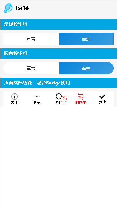
<lc-title title="按钮组"></lc-title>
<category title="常规按钮组"></category>
<lc-buttongroup class="m10">
<lc-button type="light">重置</lc-button>
<lc-button>确定</lc-button>
</lc-buttongroup>
<category title="圆角按钮组"></category>
<lc-buttongroup shape="circle" class="m10">
<lc-button type="light">重置</lc-button>
<lc-button>确定</lc-button>
</lc-buttongroup>
<category title="页面底部功能,配合Badge使用"></category>
<lc-buttongroup type="menu" class="m10">
<lc-button type="light" icon="action" color="#000">关于</lc-button>
<lc-button type="light" icon="more" color="#000">更多</lc-button>
<lc-button type="light" icon="search" color="#000">关闭</lc-button>
<lc-badge value="2" top="12px" right="26px"><lc-button type="light" icon="trolley" color="#f00">购物车</lc-button></lc-badge>
<lc-button type="light" icon="tick" color="#000">成功</lc-button>
</lc-buttongroup>
</div>
</template>
<script>
import LcTitle from '_mods/title.vue';
import Category from '_mods/category.vue';
export default {
components: { LcTitle, Category },
};
</script>
<style lang="less" scoped>
.m10{ margin-top: 10px; padding: 0 10px; box-sizing: border-box;}
</style>
|