利用网格组件可快速布局
注意事项
- 可自定义列的数量,默认为4列
- 网格内可插入图片和文字
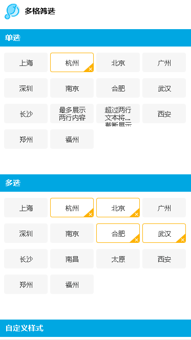
效果
使用方法
<template> |
可配置参数
| Prop | Type | Required | Default | Description |
|---|---|---|---|---|
| list | Array |
Y |
- |
数据列表,可以动态更新 |
| list[{title}] | String |
N |
'' |
标题 |
| list[{checked}] | Boolean |
N |
false |
是否选中 |
| list[{disabled}] | Boolean |
N |
false |
是否不可选中 |
| single | Boolean |
N |
false |
是否单选模式 |
| limit | Number |
N |
- |
多选模式下选择数量限制,可以动态更新 |
| customStyles | Object |
N |
{} |
自定义样式 |
| customStyles{lineSpacing} | String |
N |
12px |
行间距 |
| customStyles{width} | String |
N |
83px |
item的宽度 |
| customStyles{height} | String |
N |
36px |
item的高度 |
| customStyles{color} | String |
N |
#3d3d3d |
正常状态文字色值 |
| customStyles{checkedColor} | String |
N |
#3d3d3d |
选中状态文字色值 |
| customStyles{disabledColor} | String |
N |
#9b9b9b |
不可选状态文字色值 |
| customStyles{borderColor} | String |
N |
transparent |
正常状态边框色值 |
| customStyles{checkedBorderColor} | String |
N |
#ffb200 |
选中状态边框色值 |
| customStyles{disabledBorderColor} | String |
N |
transparent |
不可选状态边框色值 |
| customStyles{backgroundColor} | String |
N |
#f6f6f6 |
正常状态背景色值 |
| customStyles{checkedBackgroundColor} | String |
N |
#fff |
选中状态背景色值 |
| customStyles{disabledBackgroundColor} | String |
N |
#f6f6f6 |
不可选状态背景色值 |
| customStyles{icon} | String |
N |
x |
选中状态icon,base64或url,传空则不显示 |
Events
select
- 描述: 监听选择事件
参数:
{
  selectIndex:本次选择的index
  checked:是否选中
  checkedList:选中列表
}
示例:
<lc-grid-select @select="onSelect"></lc-grid-select>
overLimit
- 描述: 监听选择数量溢出事件
参数:
arg1: 限制的选择数量
示例:
<lc-grid-select @overLimit="onOverLimit"></lc-grid-select>