<template>
<div class="demo-list">
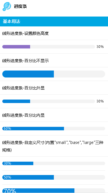
<lc-title title="进度条"></lc-title>
<category title="基本用法"></category>
<p>线形进度条-设置颜色高度</p>
<div>
<lc-cell>
<span slot="title">
<lc-progress percentage="30" strokeColor="#8e71c7"/>
</span>
</lc-cell>
</div>
<p>线形进度条-百分比不显示</p>
<div>
<lc-cell>
<span slot="title">
<lc-progress percentage="50" :showText="false" strokeWidth="24"/>
</span>
</lc-cell>
</div>
<p>线形进度条-百分比外显</p>
<div>
<lc-cell>
<span slot="title">
<lc-progress percentage="30"/>
</span>
</lc-cell>
</div>
<p>线形进度条-百分比内显</p>
<div>
<lc-cell>
<span slot="title">
<lc-progress percentage="60" :textInside="true"/>
</span>
</lc-cell>
</div>
<p>线形进度条-自定义尺寸(内置"small","base","large"三种规格)</p>
<div>
<lc-cell>
<span slot="title">
<lc-progress percentage="30" :textInside="true" size="small">
<slot>
<span>small</span>
</slot>
</lc-progress>
</span>
</lc-cell>
<lc-cell>
<span slot="title">
<lc-progress percentage="50" :textInside="true" size="base">
<slot>
<span>base</span>
</slot>
</lc-progress>
</span>
</lc-cell>
<lc-cell>
<span slot="title">
<lc-progress percentage="70" :textInside="true" size="large">
<slot>
<span>large</span>
</slot>
</lc-progress>
</span>
</lc-cell>
</div>
<p>线形进度条-状态显示</p>
<div>
<lc-cell>
<span slot="title">
<lc-progress percentage="30" strokeColor="#1890ff" status="active"/>
</span>
</lc-cell>
<lc-cell>
<span slot="title">
<lc-progress percentage="50" strokeWidth="15" status="wrong"/>
</span>
</lc-cell>
<lc-cell>
<span slot="title">
<lc-progress percentage="100" strokeColor="#1890ff" strokeWidth="15" status="success"/>
</span>
</lc-cell>
</div>
<category title="设置百分比"></category>
<div>
<lc-cell>
<span slot="title">
<lc-progress size="small" :percentage="val"/>
</span>
</lc-cell>
<lc-cell>
<span slot="title">
<lc-button type="default" shape="circle" @click="setReduceVal" small>减少</lc-button>
<lc-button type="red" shape="circle" @click="setAddVal" small>增加</lc-button>
</span>
</lc-cell>
</div>
</div>
</template>
<script>
import LcTitle from '_mods/title.vue';
import Category from '_mods/category.vue';
export default {
components: { LcTitle, Category },
data() {
return {
val: 0
};
},
methods: {
setAddVal() {
if (this.val >= 100) {
return false;
}
this.val += 10;
},
setReduceVal() {
if (this.val <= 0) {
return false;
}
this.val -= 10;
}
}
};
</script>
<style lang="less" scoped>
p{ line-height: 26px; padding:10px; font-size: 14px;}
</style>
|