<template>
<div class="wxc-demo">
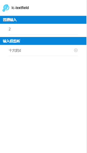
<title title="lc-textfield"></title>
<div class="container">
<category title="普通输入"></category>
<div class="form">
<lc-textfield type="number"></lc-textfield>
</div>
<category title="输入值监听"></category>
<div class="form">
<lc-textfield v-model="value1"></lc-textfield>
</div>
</div>
</div>
</template>
<style scoped>
.wxc-demo {
position: absolute;
top: 0;
bottom: 0;
left: 0;
right: 0;
background-color: #FFFFFF;
}
.container{
flex-direction: column;
align-items: center;
}
.form{
width: 600px;
}
</style>
<script>
import LcTextfield from 'lighting-ui/packages/lc-textfield';
import Category from 'lighting-ui/packages/_mods/category.vue';
import Title from 'lighting-ui/packages/_mods/title.vue';
export default {
components: { Title, Category, LcTextfield },
data: () => ({
value1: '12312',
}),
watch:{
value1(newVal, oldVal){
console.log(newVal, oldVal);
}
}
};
</script>
|