<template>
<div class="wxc-demo">
<scroller class="scroller">
<title title="lc-simple-flow"></title>
<category title="使用案例"></category>
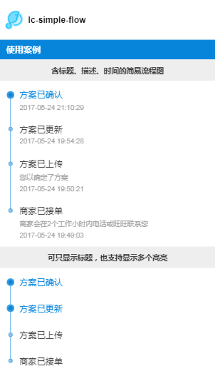
<text class="title">含标题、描述、时间的简易流程图</text>
<lc-simple-flow :list="testData1"></lc-simple-flow>
<text class="title">可只显示标题,也支持显示多个高亮</text>
<lc-simple-flow :list="testData2"></lc-simple-flow>
<text class="title">可配置主题色</text>
<lc-simple-flow :list="testData1" :themeColor="themeColor1"></lc-simple-flow>
<text class="title">支持流程图动态更新</text>
<lc-simple-flow :list="folding ? testData3 : testData3.slice(0, 4)"></lc-simple-flow>
<div class="btn">
<text class="btn-txt" @click="()=>folding=!folding">{{folding ? '模拟动态更新-减少' : '模拟动态更新-增加'}}</text>
</div>
</scroller>
</div>
</template>
<style scoped>
.wxc-demo {
position: absolute;
top: 0;
bottom: 0;
left: 0;
right: 0;
background-color: #fff;
}
.scroller {
flex: 1;
}
.title {
padding-top: 20px;
padding-bottom: 20px;
text-align: center;
font-size: 26px;
color: #333;
background-color: #eee;
font-weight: bold;
}
.btn {
width: 600px;
height: 80px;
margin-top: 20px;
margin-bottom: 30px;
margin-left: 75px;
flex-direction: row;
align-items: center;
justify-content: center;
border-radius: 6px;
background-color: #0785DB;
border-color: #0785DB;
}
.btn-txt {
color: #ffffff;
padding-top: 20px;
padding-bottom: 20px;
text-align: center;
font-size: 26px;
}
</style>
<script>
import Title from 'lighting-ui/packages/_mods/title.vue';
import Category from 'lighting-ui/packages/_mods/category.vue';
import LcSimpleFlow from 'lighting-ui/packages/lc-simple-flow';
export default {
components: { Title, Category, LcSimpleFlow },
data: () => ({
folding: false,
themeColor1: {
lineColor: '#bf280b',
pointInnerColor: '#b95048',
pointBorderColor: '#bf280b',
highlightTitleColor: '#bf280b',
highlightPointInnerColor: '#bf280b',
highlightPointBorderColor: '#d46262'
},
testData1: [
{
'date': '2017-05-24 21:10:29',
'desc': '',
'highlight': true,
'title': '方案已确认'
},
{
'date': '2017-05-24 19:54:28',
'desc': '',
'title': '方案已更新'
},
{
'date': '2017-05-24 19:50:21',
'desc': '您以确定了方案',
'title': '方案已上传'
},
{
'date': '2017-05-24 19:49:03',
'desc': '商家会在2个工作小时内电话或旺旺联系您',
'title': '商家已接单'
}
],
testData2: [
{
'highlight': true,
'title': '方案已确认'
},
{
'highlight': true,
'title': '方案已更新'
},
{
'title': '方案已上传'
},
{
'title': '商家已接单'
}
],
testData3: [
{
'date': '2017-05-24 21:10:43',
'desc': '',
'highlight': true,
'title': '预付款已支付'
},
{
'date': '2017-05-24 21:10:43',
'desc': '',
'title': '预付款已支付'
},
{
'date': '2017-05-24 21:10:41',
'desc': '',
'title': '订单待付款'
},
{
'date': '2017-05-24 21:10:29',
'desc': '',
'title': '方案已确认'
},
{
'date': '2017-05-24 19:54:28',
'desc': '',
'title': '方案已更新'
},
{
'date': '2017-05-24 19:50:21',
'desc': '您以确定了方案',
'title': '方案已上传'
},
{
'date': '2017-05-24 19:49:03',
'desc': '商家会在2个工作小时内电话或旺旺联系您',
'title': '商家已接单'
}
]
})
}
</script>
|