<template>
<div class="wxc-demo" style="height:1334px;">
<scroller class="scroller">
<title title="lc-popup"></title>
<category title="使用案例"></category>
<div class="btn"
@click="openTopPopup">
<text class="btn-txt">点击弹出顶部面板</text>
</div>
<div class="btn btn-margin bgc-1"
@click="openBottomPopup">
<text class="btn-txt">点击弹出底部面板</text>
</div>
<div class="btn btn-margin bgc-2"
@click="openLeftPopup">
<text class="btn-txt">点击弹出左侧面板</text>
</div>
<div class="btn btn-margin bgc-3"
@click="openRightPopup">
<text class="btn-txt">点击弹出右侧面板</text>
</div>
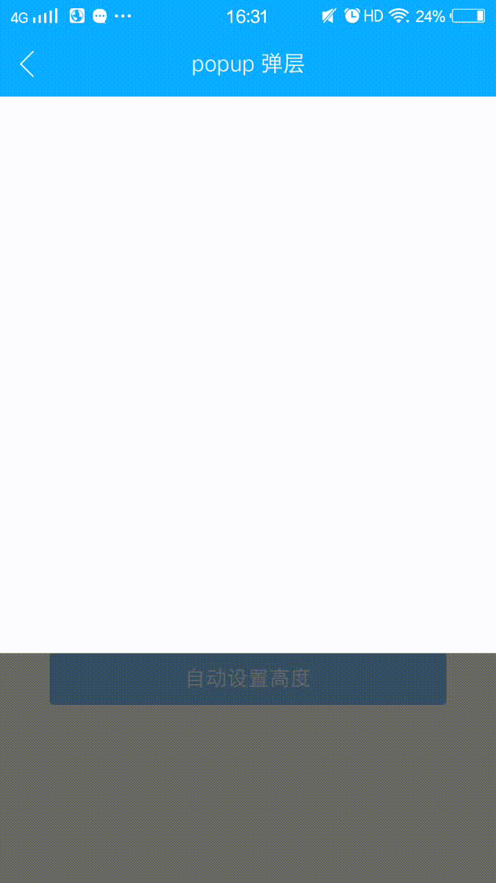
<div class="btn btn-margin bgc-4"
@click="openAutoPopup">
<text class="btn-txt">自动设置高度</text>
</div>
<lc-popup :show="isTopShow"
pos="top"
:animation="{timingFunction:'ease-out'}"
@LcPopupOverlayClicked="popupOverlayTopClick"></lc-popup>
<lc-popup :have-overlay="isTrue"
popup-color="rgb(92, 184, 92)"
:show="isBottomShow"
@LcPopupOverlayClicked="popupOverlayBottomClick"
pos="bottom"
height="400">
<div class="demo-content">
<image src="https://img.alicdn.com/tfs/TB1ojYvOXXXXXaOXFXXXXXXXXXX-180-41.png"
class="demo-image"></image>
<text>你的代码只需使用 HTML、CSS、JavaScript 可以构建原生应用,上手非常简单。</text>
</div>
</lc-popup>
<lc-popup width="500"
:show="isLeftShow"
@LcPopupOverlayClicked="popupOverlayLeftClick"
pos="left"></lc-popup>
<lc-popup width="400"
:show="isRightShow"
pos="right"
ref="LcPopup"
@LcPopupOverlayClicked="popupOverlayRightClick">
<div @click="onHideClick"
class="btn blue hide-auto">
<text class="btn-txt">主动隐藏试试</text>
</div>
</lc-popup>
<lc-popup :height="height"
:show="isAutoShow"
pos="bottom"
@LcPopupOverlayClicked="popupOverlayAutoClick"></lc-popup>
</scroller>
</div>
</template>
<style scoped>
.wxc-demo {
position: absolute;
top: 0;
bottom: 0;
left: 0;
right: 0;
background-color: #FFFFFF;
}
.scroller {
flex: 1;
}
.btn {
width: 600px;
height: 80px;
margin-top: 150px;
margin-left: 75px;
flex-direction: row;
align-items: center;
justify-content: center;
border-radius: 6px;
background-color: #0180ff;
}
.hide-auto {
width: 300px;
margin-left: 50px;
position: absolute;
bottom: 2px;
}
.bgc-1 {
background-color: #1d8dfd;
}
.bgc-2 {
background-color: #3c9af8;
}
.bgc-3 {
background-color: #63aefa;
}
.bgc-4 {
background-color: #84c2fc;
}
.btn-txt {
font-size: 32px;
color: #ffffff;
}
.btn-margin {
margin-top: 40px;
}
.demo-content {
padding-right: 40px;
padding-left: 40px;
}
.demo-image {
width: 181px;
height: 41px;
margin-bottom: 40px;
margin-top: 40px;
}
</style>
<script>
import LcPopup from 'lighting-ui/packages/lc-popup';
import Title from 'lighting-ui/packages/_mods/title.vue';
import Category from 'lighting-ui/packages/_mods/category.vue';
export default {
components: { Title, Category, LcPopup },
data: () => ({
isBottomShow: false,
isTopShow: false,
isLeftShow: false,
isRightShow: false,
isAutoShow: false,
isTrue: true,
height: 400
}),
methods: {
openBottomPopup () {
this.isBottomShow = true;
},
openTopPopup () {
this.isTopShow = true;
},
openLeftPopup () {
this.isLeftShow = true;
},
openRightPopup () {
this.isRightShow = true;
},
popupOverlayTopClick () {
this.isTopShow = false;
},
popupOverlayBottomClick () {
this.isBottomShow = false;
},
popupOverlayLeftClick () {
this.isLeftShow = false;
},
popupOverlayRightClick () {
this.isRightShow = false;
},
popupOverlayAutoClick () {
this.isAutoShow = false;
},
openAutoPopup () {
const height = this.height;
this.height = height === 400 ? 800 : 400;
this.isAutoShow = true;
},
onHideClick () {
this.$refs.LcPopup.hide();
}
}
};
</script>
|