<template>
<div class="lc-demo">
<scroller class="scroller">
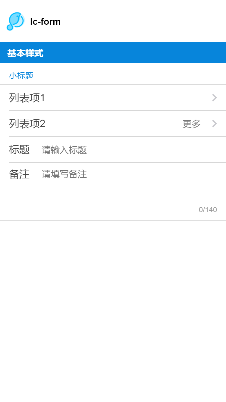
<title title="lc-form"></title>
<category title="基本样式"></category>
<lc-form title="小标题" title-color="#0785db">
<lc-cell label="列表项1"
:value="value"
:has-arrow="true"
:has-bottom-border="false">
</lc-cell>
<lc-cell label="列表项2"
title="更多"
:value="value"
:has-arrow="true"
:has-top-border="false"
:has-bottom-border="false">
</lc-cell>
<lc-input label="标题"
v-model="value"
placeholder="请输入标题"
:has-top-border="false"
:has-bottom-border="false">
</lc-input>
<lc-textarea label="备注"
placeholder="请填写备注"
:rows="4"
:max="140"
:cell-style="cellStyle"
:has-top-border="false"></lc-textarea>
</lc-form>
</scroller>
</div>
</template>
<style scoped>
.lc-demo {
position: absolute;
top: 0;
right: 0;
left: 0;
bottom: 0;
background-color: #fff;
}
.scroller {
flex: 1;
}
</style>
<script>
import Title from 'lighting-ui/packages/_mods/title.vue';
import Category from 'lighting-ui/packages/_mods/category.vue';
import LcForm from 'lighting-ui/packages/lc-form';
import LcCell from 'lighting-ui/packages/lc-cell';
import LcInput from 'lighting-ui/packages/lc-input';
import LcTextarea from 'lighting-ui/packages/lc-textarea';
export default {
components: { Title, Category, LcForm, LcCell, LcTextarea, LcInput },
data: () => ({
value: '',
cellStyle: {
backgroundColor: '#fff'
}
})
}
</script>
|