<template>
<div class="wxc-demo">
<scroller class="scroller">
<div class="wrapper">
<title title="lc-searchbar"></title>
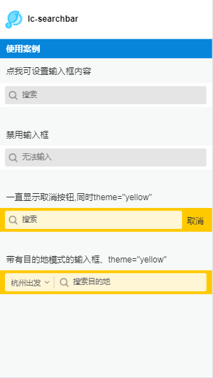
<category title="使用案例"></category>
</div>
<text class="value-text"
@click="setValue">点我可设置输入框内容</text>
<div class="demo">
<lc-searchbar ref="lc-searchbar" cancelColor="red"
@LcSearchbarCancelClicked="LcSearchbarCancelClicked"
@LcSearchbarInputReturned="LcSearchbarInputReturned"
@LcSearchbarInputOnInput="LcSearchbarInputOnInput"
@LcSearchbarCloseClicked="LcSearchbarCloseClicked"
@LcSearchbarInputOnFocus="LcSearchbarInputOnFocus"
@LcSearchbarInputOnBlur="LcSearchbarInputOnBlur"></lc-searchbar>
<text class="value-text">{{value}}</text>
</div>
<text class="hint">禁用输入框</text>
<div class="demo demo1">
<lc-searchbar :disabled="isDisabled"
placeholder="无法输入"
@LcSearchbarInputDisabledClicked="LcSearchbarInputDisabledClicked"></lc-searchbar>
</div>
<text class="hint">一直显示取消按钮,同时theme="yellow"</text>
<div class="demo demo1">
<lc-searchbar :always-show-cancel="showCancel"
theme="yellow"
@searchbarCancelClick="searchbarCancelClick"></lc-searchbar>
</div>
<text class="hint">带有目的地模式的输入框、theme="yellow"</text>
<div class="demo demo1">
<lc-searchbar class="searchbar"
placeholder="搜索目的地"
theme="yellow"
mod="hasDep"
dep-name="杭州出发"
@LcSearchbarDepChooseClicked="LcSearchbarDepChooseClicked"
@LcSearchbarInputDisabledClicked="LcSearchbarInputDisabledClicked"></lc-searchbar>
</div>
</scroller>
</div>
</template>
<style scoped>
.wxc-demo {
position: absolute;
top: 0;
bottom: 0;
left: 0;
right: 0;
background-color: #F6F9F8;
}
.scroller {
flex: 1;
}
.wrapper {
background-color: #FFFFFF;
}
.demo {
height: 160px;
}
.demo1 {
margin-top: 20px;
}
.value-text {
margin: 24px;
font-size: 30px;
color: #333;
}
.hint {
margin-left: 24px;
font-size: 30px;
color: #333;
}
</style>
<script>
import Light from 'light';
const modal = Light.requireModule('modal');
import Title from 'lighting-ui/packages/_mods/title.vue';
import Category from 'lighting-ui/packages/_mods/category.vue';
import LcSearchbar from 'lighting-ui/packages/lc-searchbar';
export default {
components: { Title, Category, LcSearchbar },
data: () => ({
value: '',
showCancel: true,
isDisabled: true
}),
methods: {
setValue () {
this.$refs['lc-searchbar'].setValue('点击了手动设置输入框内容的开关');
},
LcSearchbarInputOnFocus () {
modal.toast({ 'message': 'onfocus', 'duration': 1 });
},
LcSearchbarInputReturned(){
modal.toast({ 'message': 'Returned', 'duration': 1 });
},
LcSearchbarInputOnBlur () {
modal.toast({ 'message': 'onbulr', 'duration': 1 });
},
LcSearchbarCloseClicked () {
modal.toast({ 'message': 'close.click', 'duration': 1 });
},
LcSearchbarInputOnInput (e) {
this.value = e.value;
},
LcSearchbarCancelClicked () {
modal.toast({ 'message': 'cancel.click', 'duration': 1 });
},
LcSearchbarInputDisabledClicked () {
modal.toast({ 'message': 'input.onclick', 'duration': 1 });
},
LcSearchbarDepChooseClicked () {
modal.toast({ 'message': 'dep.choose.click', 'duration': 1 });
},
searchbarCancelClick(){
modal.toast({ 'message': 'CancelClick', 'duration': 1 });
}
}
};
</script>
|