<template>
<div class="wxc-demo">
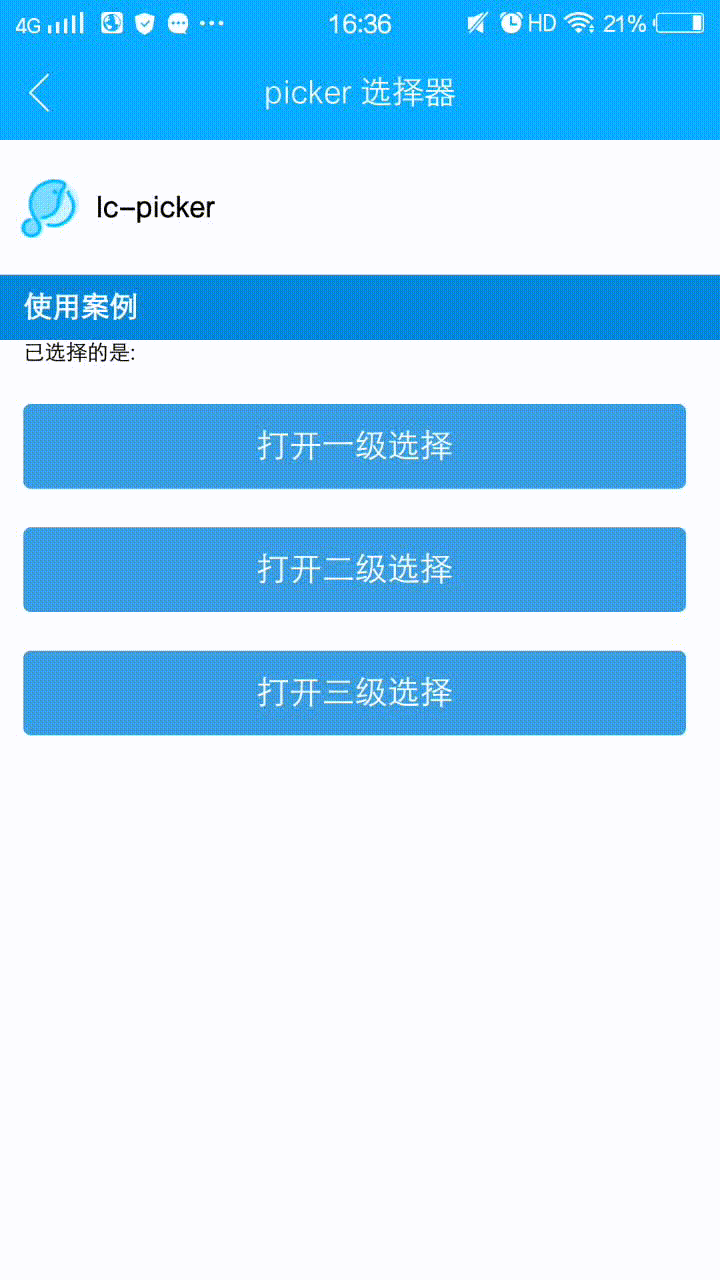
<title title="lc-picker"></title>
<category title="使用案例"></category>
<div class="button-list">
<text>已选择的是: {{val}}</text>
<lc-button text="打开一级选择" class="btn-margin"
type="normal"
@LcButtonClicked="openPicker1"></lc-button>
<lc-button text="打开二级选择" class="btn-margin"
type="normal"
@LcButtonClicked="openPicker2"></lc-button>
<lc-button text="打开三级选择" class="btn-margin"
type="normal"
@LcButtonClicked="openPicker3"></lc-button>
</div>
<lc-popup width="750"
:show="show1"
pos="bottom"
height="470"
ref="LcPopup"
@LcPopupOverlayClicked="closePicker">
<text class="text" @click="selectPicker1">完成</text>
<picker ref="picker1" :pickerData="pickerData1" class="date-picker"></picker>
</lc-popup>
<lc-popup width="750"
:show="show2"
pos="bottom"
height="470"
ref="LcPopup"
@LcPopupOverlayClicked="closePicker">
<text class="text" @click="selectPicker2">完成</text>
<picker ref="picker2" :pickerData="pickerData2" class="date-picker"></picker>
</lc-popup>
<lc-popup width="750"
:show="show3"
pos="bottom"
height="470"
ref="LcPopup"
@LcPopupOverlayClicked="closePicker">
<text class="text" @click="selectPicker3">完成</text>
<picker ref="picker3" :pickerData="pickerData3" class="date-picker"></picker>
</lc-popup>
</div>
</template>
<style scoped>
.wxc-demo {
position: absolute;
top: 0;
bottom: 0;
left: 0;
right: 0;
background-color: #FFFFFF;
}
.date-picker {
width: 750px;
height: 470px;
}
.button-list {
padding-left: 24px;
}
.btn-margin {
margin-top: 40px;
}
.text{
width: 750px; height: 80px; color: #333; font-size: 30px; text-align: right; padding: 10px;
}
</style>
<script>
import LcPopup from 'lighting-ui/packages/lc-popup';
import picker from 'lighting-ui/packages/lc-picker';
import Title from 'lighting-ui/packages/_mods/title.vue';
import Category from 'lighting-ui/packages/_mods/category.vue';
import LcButton from 'lighting-ui/packages/lc-button';
import Date from 'date.js';
export default {
components: { Title, Category, LcPopup, picker,LcButton },
data: () => ({
val:'',
show1:false,
show2:false,
show3:false,
pickerData1: {
columns: 1,
data: [{key: "1"},{key: "2"},{key: "3"},{key: "4"}]
},
pickerData2: {
columns: 2,
data: [
{
key: "浙江省",
values: ["杭州", "宁波", "温州", "金华", "台州"]
},
{
key: "江苏省",
values: ["南京", "镇江", "扬州", "苏州", "无锡"]
}
]
},
pickerData3: {
columns: 3,
data: Date.data
},
}),
methods:{
openPicker1 () {
this.show1 = true;
this.$nextTick(()=>{
this.$refs.picker1.setSelectedIndex([2])
})
},
openPicker2 () {
this.show2 = true;
this.$nextTick(()=>{
this.$refs.picker2.setSelectedIndex([1,2])
})
},
openPicker3 () {
this.show3 = true;
},
closePicker (){
this.show1 = false;
this.show2 = false;
this.show3 = false;
},
selectPicker1 (){
this.$refs.picker1.getSelectedItem((result) => {
this.val = this.pickerData1.data[result[0]].key;
})
this.show1 = false;
},
selectPicker2 (){
this.$refs.picker2.getSelectedItem((result) => {
this.val = this.pickerData2.data[result[0]].key + this.pickerData2.data[result[0]].values[result[1]];
})
this.show2 = false;
},
selectPicker3 (){
this.$refs.picker3.getSelectedItem((result) => {
this.val = this.pickerData3.data[result[0]].key + this.pickerData3.data[result[0]].values[result[1]].key + this.pickerData3.data[result[0]].values[result[1]].values[result[2]];
})
this.show3 = false;
}
}
};
</script>
|