<template>
<div class="lc-demo">
<lc-title title="lc-popover"></lc-title>
<category title="使用案例"></category>
<div>
<div class="demo1">
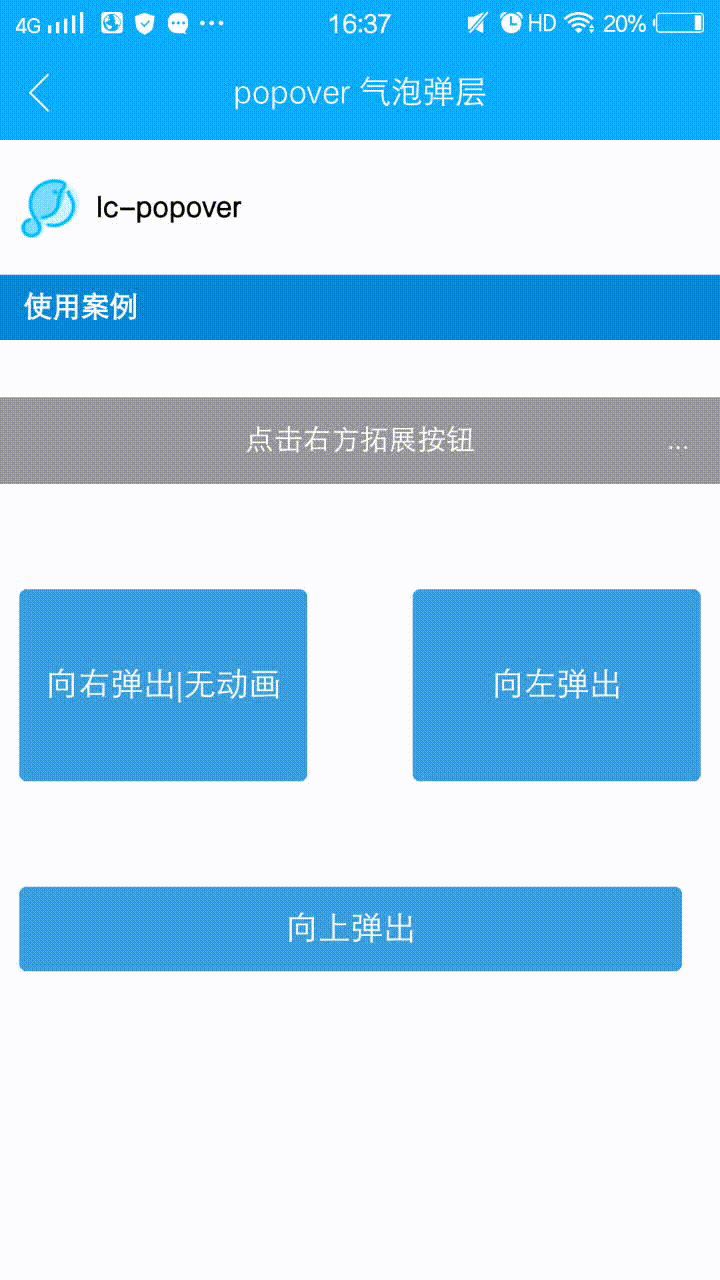
<lc-minibar title="点击右方拓展按钮"
background-color="#999"
@LcMinibarRightButtonClicked="minibarRightButtonClick"
right-text="..."></lc-minibar>
</div>
<div class="demo demo3">
<lc-button text="向右弹出|无动画" type="normal" :btnStyle="btn3Style" @LcButtonClicked="LcButtonClicked3"></lc-button>
<lc-button text="向左弹出" type="normal" :btnStyle="btn4Style" @LcButtonClicked="LcButtonClicked4"></lc-button>
</div>
<div class="demo demo2">
<lc-button text="向上弹出" @LcButtonClicked="LcButtonClicked2"></lc-button>
</div>
<lc-popover ref="lc-popover1"
:buttons="btns"
:position="popoverPosition"
:arrowPosition="popoverArrowPosition"
@LcPopoverButtonClicked="popoverButtonClicked"
></lc-popover>
<lc-popover ref="lc-popover2"
:buttons="btns2"
:position="popoverPosition2"
:arrowPosition="popoverArrowPosition2"
@LcPopoverButtonClicked="popoverButtonClicked"
></lc-popover>
<lc-popover ref="lc-popover3"
:buttons="btns3"
:position="popoverPosition3"
:hasAnimation="false"
:arrowPosition="popoverArrowPosition3"
@LcPopoverButtonClicked="popoverButtonClicked"
></lc-popover>
<lc-popover ref="lc-popover4"
:buttons="btns4"
:position="popoverPosition4"
:arrowPosition="popoverArrowPosition4"
@LcPopoverButtonClicked="popoverButtonClicked"
></lc-popover>
</div>
</div>
</template>
<style scoped>
.lc-demo {
background-color: #FFFFFF;
}
.scroller{height: 1000px;}
.demo {
width: 750px;
padding-top: 60px;
align-items: center;
flex-direction: row;
padding: 60px 10px;
justify-content: space-between;
}
.demo1 {
margin-top: 80px;
}
.demo2 {
justify-content: center;
}
.demo3 {
padding: 100px 30px 45px 30px;
}
</style>
<script>
import Light from 'light';
import LcTitle from 'lighting-ui/packages/_mods/title.vue';
import Category from 'lighting-ui/packages/_mods/category.vue';
import LcMinibar from 'lighting-ui/packages/lc-minibar';
import LcButton from 'lighting-ui/packages/lc-button';
import LcPopover from 'lighting-ui/packages/lc-popover';
const modal = Light.requireModule('modal');
import {WEEXUI_ICON, RETURN_ICON, SCAN_ICON, QRCODE_ICON, QUESTION_ICON } from 'popover.js';
export default {
components: { LcTitle, Category, LcMinibar, LcButton, LcPopover },
data: () => ({
leftButton: RETURN_ICON,
btns: [
{
icon: SCAN_ICON,
text: 'Scan',
key: 'key-scan'
},
{
icon: QRCODE_ICON,
text: 'My Qrcode',
key: 'key-qrcode'
},
{
icon: QUESTION_ICON,
text: 'Help',
key: 'key-help'
}
],
popoverPosition: { x: -4, y: 360 },
popoverArrowPosition: { pos: 'top', x: -26 },
btns2: [
{
text: 'Popover Select 1',
key: 's1'
},
{
text: 'Popover Select 2',
key: 's2'
},
{
text: 'Popover Select 3',
key: 's3'
}
],
popoverPosition2: { x: 200, y: 520 },
popoverArrowPosition2: { pos: 'bottom', x: 160 },
btns3: [
{ icon: WEEXUI_ICON, text: 'Item 1', key: 's1'},
{ icon: WEEXUI_ICON, text: 'Item 2', key: 's2'},
{ icon: WEEXUI_ICON, text: 'Item 3', key: 's3'}
],
popoverPosition3: { x: 325, y: 550 },
popoverArrowPosition3: { pos: 'left', y: 0 },
btns4: [
{ icon: WEEXUI_ICON, text: 'Item 1', key: 's1'},
{ icon: WEEXUI_ICON, text: 'Item 2', key: 's2'},
{ icon: WEEXUI_ICON, text: 'Item 3', key: 's3'}
],
popoverPosition4: { x: 175, y: 380 },
popoverArrowPosition4: { pos: 'right', y: -50 },
btn3Style:{
height: '200px',
width: '300px'
},
btn4Style:{
height: '200px',
width: '300px'
}
}),
methods: {
minibarRightButtonClick () {
this.$refs['lc-popover1'].lcPopoverShow();
},
popoverButtonClicked (obj) {
modal.toast({ 'message': `key:${obj.key}, index:${obj.index}`, 'duration': 1 });
},
LcButtonClicked3(){
this.$refs['lc-popover3'].lcPopoverShow();
},
LcButtonClicked4(){
this.$refs['lc-popover4'].lcPopoverShow();
},
LcButtonClicked2(){
this.$refs['lc-popover2'].lcPopoverShow();
}
}
};
</script>
|