<template>
<div class="wxc-demo">
<scroller class="scroller">
<title title="lc-loading"></title>
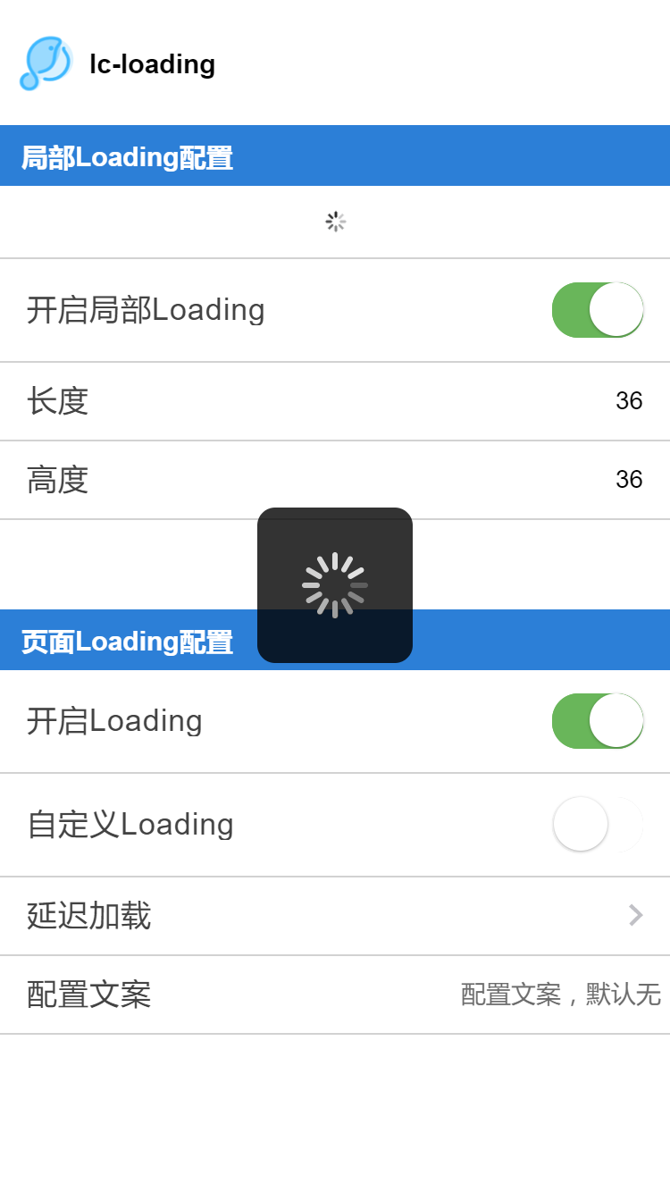
<category title="局部Loading配置"></category>
<div class="demo">
<lc-part-loading :show="partShow"
:width="width"
:height="height"
:src="imgSrc"></lc-part-loading>
</div>
<lc-cell :has-top-border="true"
:auto-accessible="false"
label="开启局部Loading">
<switch :checked="partShow"
slot="value"
@change="partShow= !partShow"></switch>
</lc-cell>
<lc-cell :has-top-border="false"
label="长度">
<input class="input"
slot="value"
placeholder="局部Loading长度,默认36"
v-model="width"
@input="width=$event.value"/>
</lc-cell>
<lc-cell :has-top-border="false"
label="高度">
<input class="input"
slot="value"
placeholder="局部Loading高度,默认36"
v-model="height"
@input="height=$event.value"/>
</lc-cell>
<div class="blank"></div>
<category title="页面Loading配置"></category>
<lc-cell :has-top-border="false"
:auto-accessible="false"
label="开启Loading">
<switch :checked="isShow"
slot="value"
@change="isShow= !isShow"></switch>
</lc-cell>
<lc-cell :has-top-border="false"
:auto-accessible="false"
label="自定义Loading">
<switch :checked="type === 'trip'"
slot="value"
@change="type=(type === 'trip'? 'default' : 'trip')"></switch>
</lc-cell>
<lc-cell :has-top-border="false"
:has-arrow="true"
@LcCellClicked="openIntervalLoading"
label="延迟加载"></lc-cell>
<lc-cell :has-top-border="false"
label="配置文案">
<input class="input"
slot="value"
placeholder="配置文案,默认无"
v-model="loadingText"
@input="loadingText=$event.value"/>
</lc-cell>
</scroller>
<lc-loading :show="isShow" :needMask="false" @LcLoadingMaskClicked="LcLoadingMaskClicked"
:type="type" :mask-style="maskStyle"
:loading-text="loadingText" :src="imgSrc"
:interval="interval"></lc-loading>
</div>
</template>
<script>
import Title from 'lighting-ui/packages/_mods/title.vue';
import Category from 'lighting-ui/packages/_mods/category.vue';
import LcCell from 'lighting-ui/packages/lc-cell'
import LcLoading from 'lighting-ui/packages/lc-loading'
import LcPartLoading from 'lighting-ui/packages/lc-part-loading'
export default {
components: { Title, Category, LcLoading, LcCell, LcPartLoading },
data () {
return {
width: '36',
height: '36',
partShow: true,
isShow: true,
interval: 0,
type: 'default',
loadingText: '',
maskStyle:{ backgroundColor:'rgba(0, 0, 0, 0.3)'},
imgSrc:'https://img-blog.csdnimg.cn/20190524100545693.gif'
};
},
methods: {
LcLoadingMaskClicked(){
console.log(1)
},
openLoading () {
this.isShow = !this.isShow;
this.interval = 0;
},
openTripLoading () {
const { type } = this;
this.type = (type === 'trip') ? 'default' : 'trip';
},
openIntervalLoading () {
this.isShow = false;
setTimeout(() => {
this.interval = 1000;
this.isShow = true;
}, 10)
},
openTextLoading () {
this.interval = 0;
this.loadingText = this.loadingText ? '' : '正在加载中';
}
}
};
</script>
<style scoped>
.wxc-demo {
position: fixed;
top: 0;
right: 0;
left: 0;
bottom: 0;
background-color: #fff;
}
.scroller {
flex: 1;
}
.input {
width: 500px;
text-align: right;
font-size: 28px;
}
.demo {
padding-top: 20px;
padding-bottom: 20px;
align-items: center;
height: 80px;
justify-content: center;
}
.blank {
height: 80px;
}
</style>
|