<template>
<div class="wxc-demo">
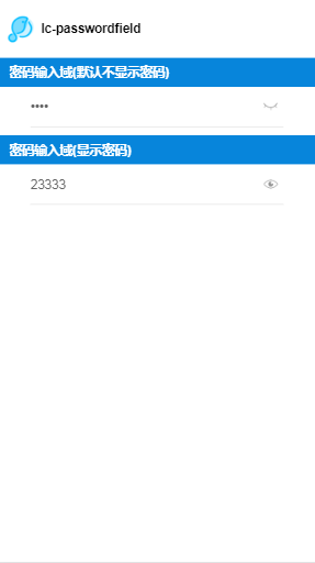
<title title="lc-passwordfield"></title>
<div class="container">
<category title="密码输入域(默认不显示密码)"></category>
<div class="form">
<lc-passwordfield type="password" :autofocus="true"></lc-passwordfield>
</div>
<category title="密码输入域(显示密码)"></category>
<div class="form">
<lc-passwordfield type="password" :pwdShow="true" ></lc-passwordfield>
</div>
</div>
</div>
</template>
<style scoped>
.wxc-demo {
position: absolute;
top: 0;
bottom: 0;
left: 0;
right: 0;
background-color: #FFFFFF;
}
.container{
flex-direction: column;
align-items: center;
}
.form{
width: 600px;
}
</style>
<script>
import LcPasswordfield from 'lighting-ui/packages/lc-passwordfield';
import Category from 'lighting-ui/packages/_mods/category.vue';
import Title from 'lighting-ui/packages/_mods/title.vue';
export default {
components: { Title, Category, LcPasswordfield },
data: () => ({
}),
created () {
},
methods: {
}
};
</script>
|