遮罩弹层组件,可定制内容
效果
使用方法
<template>
<div class="wxc-demo">
<scroller class="scroller">
<title title="lc-mask"
class="wxc-title"></title>
<category title="使用案例"></category>
<div class="button-list">
<lc-button text="点击弹出动画面板" class="btn-margin"
type="normal"
@LcButtonClicked="openMask"></lc-button>
<lc-button text="点击弹出无动画面板" class="btn-margin"
type="normal"
@LcButtonClicked="openNoAnimationMask"></lc-button>
</div>
<lc-mask height="800"
width="702"
border-radius="0"
duration="300"
mask-bg-color="#FFFFFF"
:has-overlay="true"
:show-close="true"
:show="show"
top="200"
:overlay-can-close="canClose"
:has-animation="hasAnimation"
@LcMaskSetHidden="LcMaskSetHidden">
<div class="content">
<div class="demo-title">
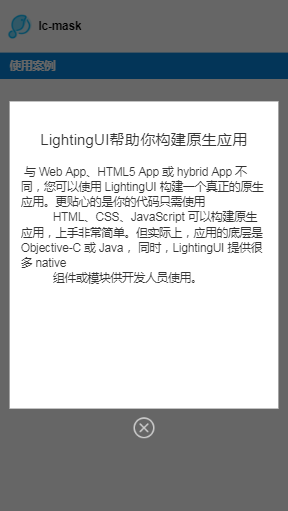
<text class="title">LightingUI帮助你构建原生应用</text>
</div>
<text class="content-text"> 与 Web App、HTML5 App 或 hybrid App 不同,您可以使用 LightingUI 构建一个真正的原生应用。更贴心的是你的代码只需使用
HTML、CSS、JavaScript 可以构建原生应用,上手非常简单。但实际上,应用的底层是 Objective-C 或 Java, 同时,LightingUI 提供很多 native
组件或模块供开发人员使用。 </text>
</div>
</lc-mask>
</scroller>
</div>
</template>
<style scoped>
.button-list {
padding-left: 24px;
}
.btn-margin {
margin-top: 40px;
}
.wxc-demo {
position: absolute;
top: 0;
bottom: 0;
left: 0;
right: 0;
}
.scroller {
flex: 1;
background-color: #fff;
}
.btn {
width: 600px;
height: 80px;
margin-top: 300px;
flex-direction: row;
align-items: center;
align-self: center;
justify-content: center;
border-radius: 6px;
background-color: rgb(92, 184, 92);
border-color: rgb(76, 174, 76);
}
.yellow {
background-color: #FDC22D;
border-color: #FDC22D;
}
.btn-txt {
font-size: 32px;
color: #ffffff;
}
.btn-margin {
margin-top: 40px;
}
.content {
padding: 30px;
}
.demo-title {
align-items: center;
margin-bottom: 20px;
margin-top: 40px;
}
.title {
color: #333333;
font-size: 40px;
}
.wxc-title {
align-self: flex-start;
}
.content-text {
color: #333333;
font-size: 30px;
margin-top: 20px;
}
</style>
<script>
import LcMask from 'lighting-ui/packages/lc-mask';
import Title from 'lighting-ui/packages/_mods/title.vue';
import Category from 'lighting-ui/packages/_mods/category.vue';
import LcButton from 'lighting-ui/packages/lc-button';
export default {
components: { Title, Category,LcButton, LcMask },
data: () => ({
show: false,
hasAnimation: true,
canClose: true
}),
methods: {
openMask (e) {
this.show = true;
this.hasAnimation = true;
this.canClose = false;
},
LcMaskSetHidden () {
this.show = false;
},
openNoAnimationMask (e) {
this.show = true;
this.hasAnimation = false;
this.canClose = true;
}
}
};
</script>
|
可配置参数
| Prop |
Type |
Required |
Default |
Description |
| show |
Bool |
Y |
false |
是否显示 |
| width |
Number |
Y |
702 |
面板的宽度 |
| height |
Number |
Y |
800 |
面板的高度 |
| top |
Number |
N |
'' |
面板的 top 值,不设置时默认垂直居中 |
| has-animation |
Bool |
N |
true |
面板弹出是否动画 |
| show-close |
Bool |
N |
false |
是否显示关闭按钮 |
| has-overlay |
Bool |
N |
true |
是否有蒙层 |
| border-radius |
Number |
N |
0 |
弹出的 border-radius |
| overlay-can-close |
Bool |
N |
true |
点击 overlay 灰层是否可以关闭 |
| mask-bg-color |
String |
N |
#ffffff |
mask 的背景颜色 |
| duration |
String |
N |
300 |
弹层出现时间 |
| timing-function |
String |
N |
ease-in |
弹层出现动画方式 |
| overlay-cfg |
Object |
N |
注1 |
蒙层配置参数 |
注1
{
  hasAnimation: true,
  timingFunction: ['ease-in', 'ease-out'],
  canAutoClose: true,
  duration: 300,
  opacity: 0.6
}
|
事件回调
@LcMaskSetHidden="LcMaskSetHidden"
@LcMaskCloseClick="LcMaskCloseClick"
@LcOverlayBodyClicked="LcOverlayBodyClicked"
|