复选框组件
注意事项
- 建议以成组的方式出现,使用
lc-checkbox-list
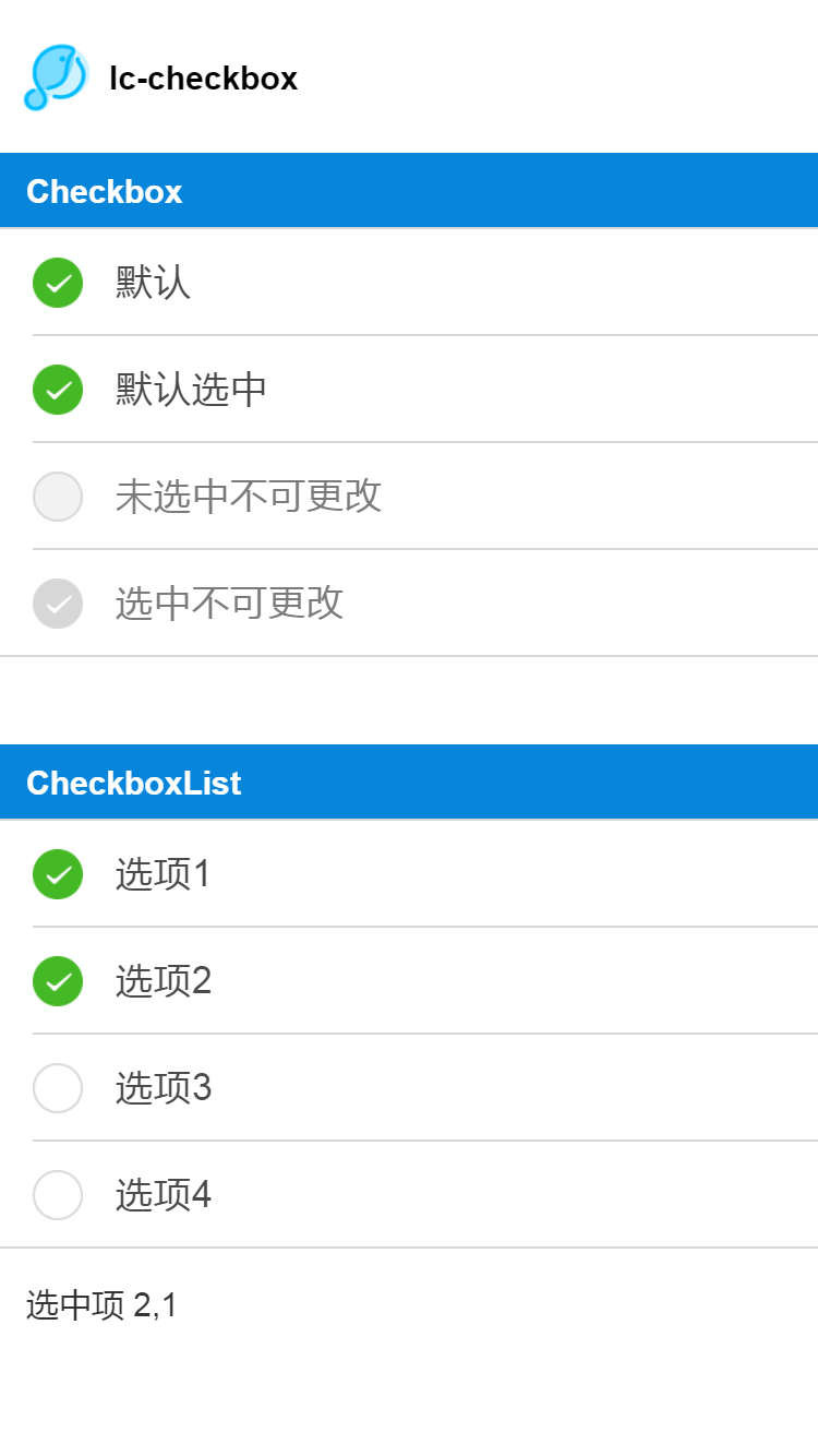
效果
使用方法
<template> |
可配置参数
| Prop | Type | Required | Default | Description |
|---|---|---|---|---|
| label | String |
Y |
- |
标签 |
| value | [String、Number、Object] |
Y |
- |
绑定的值 |
| checked | Boolean |
N |
false |
是否选中 |
| disabled | Boolean |
N |
false |
是否不可选 |
| config | Object |
N |
{} |
覆盖颜色和 icon |
| has-top-border | Boolean |
N |
true |
是否有上边框 |
| has-bottom-border | Boolean |
N |
true |
是否有下边框 |
- 事件回调
//点击事件回调  `@LcCheckboxItemChecked="LcCheckboxItemChecked"`
将会返回e.value、e.checked
CheckboxList
| Prop | Type | Required | Default | Description |
|---|---|---|---|---|
| list | Array |
Y |
[] |
checkbox列表配置 (*1) |
| config | Object |
N |
{} |
覆盖颜色和 icon (*2) |
注1:
listconst list=[
{ title: '选项1', value: 1 },
{ title: '选项2', value: 2, checked: true },
{ title: '选项3', value: 3 },
{ title: '选项4', value: 4 }
];注2:
config
// 你可以这样覆盖样式和 icon: |
- 事件回调
//点击事件回调  `@LcCheckboxListChecked="LcCheckboxListChecked"`
将会返回已经选中的e.checkedList