<template>
<div class="wxc-demo">
<scroller class="scroller">
<title title="lc-ep-slider"></title>
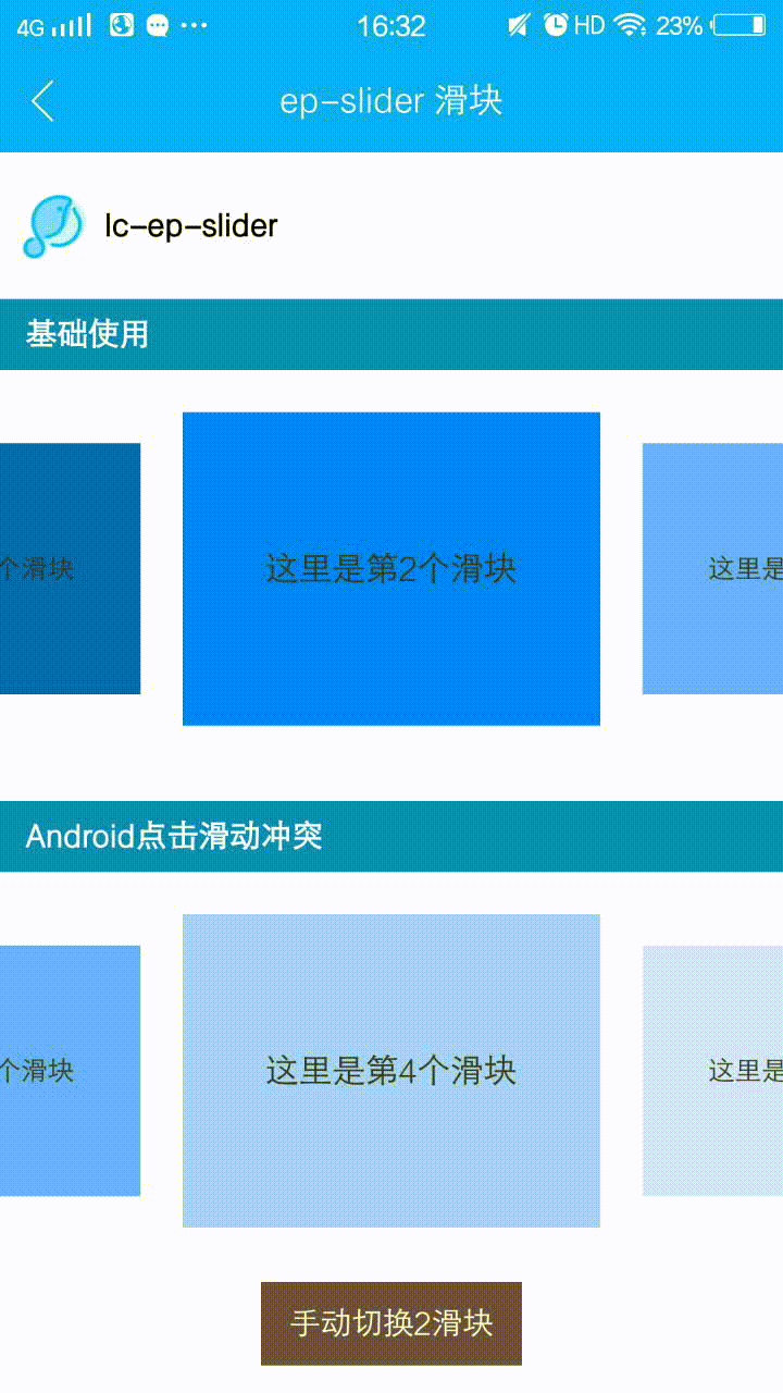
<category title="基础使用"></category>
<div class="wrapper">
<lc-ep-slider :slider-id="sliderId"
:card-length='cardLength'
:card-s="cardSize"
:select-index="2"
@LcEpSliderCurrentIndexSelected="LcEpSliderCurrentIndexSelected">
<div v-for="(v,index) in [1,2,3,4,5]"
:key="index"
:slot="`card${index}_${sliderId}`"
:class="['slider',`slider${index}`]"
:accessible="true"
:aria-label="`这里是第${index + 1}个滑块`">
<text class="text">这里是第{{index + 1}}个滑块</text>
</div>
</lc-ep-slider>
</div>
<category title="Android点击滑动冲突"></category>
<div class="wrapper">
<lc-ep-slider :slider-id="autoSliderId"
:card-length='cardLength'
ref="lc-ep-slider"
:card-s="cardSize"
:auto-play="true"
:select-index="2"
@LcEpSliderCurrentIndexSelected="LcEpSliderCurrentIndexSelected">
<lc-pan-item v-for="(v,index) in [1,2,3,4,5]"
:key="index"
:ext-id="index"
:class="['slider',`slider${index}`]"
@LcPanItemPan="LcPanItemPan"
@LcPanItemClick="LcPanItemClick(index)"
:slot="`card${index}_${autoSliderId}`"
:accessible="true"
:aria-label="`这里是第${index + 1}个滑块`">
<text class="text" >这里是第{{index + 1}}个滑块</text>
</lc-pan-item>
</lc-ep-slider>
<div class="btn" @click="onClick">
<text class="btn-text">手动切换2滑块</text>
</div>
</div>
</scroller>
</div>
</template>
<style scoped>
.wxc-demo {
position: absolute;
top: 0;
right: 0;
left: 0;
bottom: 0;
background-color: #fff;
}
.scroller {
flex: 1;
}
.wrapper {
padding-top: 40px;
}
.text {
font-size: 32px;
color: #333333;
}
.btn {
width: 250px;
height: 80px;
margin-left: 250px;
background-color: #635147;
align-items: center;
justify-content: center;
margin-bottom: 40px;
}
.btn-text {
font-size: 30px;
color: #ffffff;
}
.slider {
width: 400px;
height: 300px;
background-color: #0064c8;
align-items: center;
justify-content: center;
}
.slider1 {
background-color: #0080ff;
}
.slider2 {
background-color: #62b0ff;
}
.slider3 {
background-color: #a2d0ff;
}
.slider4 {
background-color: #cce6ff;
}
</style>
<script>
import Light from 'light'
const modal = Light.requireModule('modal');
import LcEpSlider from 'lighting-ui/packages/lc-ep-slider';
import LcPanItem from 'lighting-ui/packages/lc-pan-item';
import Utils from 'lighting-ui/packages/utils';
import Title from 'lighting-ui/packages/_mods/title.vue';
import Category from 'lighting-ui/packages/_mods/category.vue';
export default {
components: { Title, Category, LcEpSlider, LcPanItem },
data: () => ({
sliderId: 1,
autoSliderId: 2,
cardLength: 5,
cardSize: {
width: 400,
height: 300,
spacing: 0,
scale: 0.8
}
}),
methods: {
LcEpSliderCurrentIndexSelected (e) {
},
onClick () {
this.$refs['lc-ep-slider'].manualSetPage(1);
},
LcPanItemPan (e) {
console.log(22222)
if (Utils.env.supportsEBForAndroid()) {
this.$refs['lc-ep-slider'].clearAutoPlay();
this.$refs['lc-ep-slider'].bindExp(e.element)
}
},
LcPanItemClick (e) {
modal.toast({
message: e,
duration: 1
})
}
}
}
</script>
|