<template>
<div class="lc-demo">
<scroller class="container">
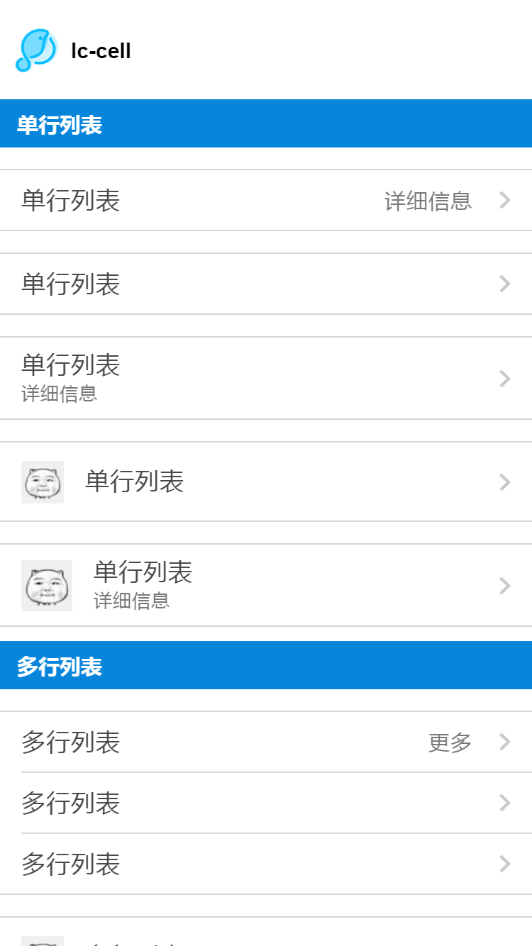
<title title="lc-cell"></title>
<category title="单行列表"></category>
<div class="demo">
<lc-cell label="单行列表"
title="详细信息"
:has-arrow="true"
:link="link"
@LcCellClicked="LcCellClicked"></lc-cell>
</div>
<div class="demo">
<lc-cell label="单行列表"
:has-arrow="true"
@LcCellClicked="LcCellClicked"></lc-cell>
</div>
<div class="demo">
<lc-cell label="单行列表"
desc="详细信息"
:link="link"
@LcCellClicked="LcCellClicked"
:has-arrow="true"></lc-cell>
</div>
<div class="demo">
<lc-cell label="单行列表"
:icon="icon"
:has-arrow="true"
:auto-accessible="true"></lc-cell>
</div>
<div class="demo">
<lc-cell label="单行列表"
:icon="icon"
desc="详细信息"
:has-arrow="true"
:auto-accessible="true"></lc-cell>
</div>
<category title="多行列表"></category>
<div class="demo">
<lc-cell label="多行列表"
title="更多"
@LcCellClicked="LcCellClicked"
:has-arrow="true"
:has-bottom-border="false"></lc-cell>
<lc-cell label="多行列表"
:has-arrow="true"
@LcCellClicked="LcCellClicked"
:has-top-border="false"
:has-bottom-border="false"></lc-cell>
<lc-cell label="多行列表"
@LcCellClicked="LcCellClicked"
cell-index="last"
:has-arrow="true"
:has-top-border="false"></lc-cell>
</div>
<div class="demo">
<lc-cell label="多行列表"
@LcCellClicked="LcCellClicked"
:icon="icon"
:has-arrow="true"
:has-bottom-border="false"></lc-cell>
<lc-cell label="多行列表"
:icon="icon"
:has-arrow="true"
@LcCellClicked="LcCellClicked"
:has-top-border="false"
:has-bottom-border="false"></lc-cell>
<lc-cell label="多行列表"
:icon="icon"
@LcCellClicked="LcCellClicked"
:has-arrow="true"
:has-top-border="false"></lc-cell>
</div>
<category title="自定义样式" class="category"></category>
<div class="demo">
<lc-cell :has-arrow="false"
:auto-accessible="false">
<text :style="{color:color}"
slot="label">自定义标签</text>
<switch slot="value"
@change="color= color==='#4A4A4A' ? '#0785DB' : '#4A4A4A'"></switch>
</lc-cell>
</div>
<div class="demo">
<lc-cell :has-arrow="false"
:auto-accessible="false"
:cell-style="cellStyle">
<text :style="{color:color1,textAlign: textAlign}"
slot="title">自定义标题</text>
<switch slot="value"
@change="color1= color1==='#7A7A7A' ? '#399DE2' : '#7A7A7A'"></switch>
</lc-cell>
</div>
</scroller>
</div>
</template>
<style scoped>
.lc-demo {
width: 750px;
position: absolute;
top: 0;
right: 0;
left: 0;
bottom: 0;
background-color: #ffffff;
}
.container {
flex: 1;
}
.demo {
width: 750px;
margin-top: 30px;
}
.category {
margin-top: 40px;
}
.default {
color: #000;
}
.demo-title {
font-size: 30px;
color: #333;
margin-top: 30px;
margin-left: 30px;
margin-bottom: 16px;
}
</style>
<script>
import Title from 'lighting-ui/packages/_mods/title.vue';
import Category from 'lighting-ui/packages/_mods/category.vue';
import LcCell from 'lighting-ui/packages/lc-cell';
export default {
components: { LcCell, Title, Category },
data: () => ({
color: '#0785DB',
color1: '#399DE2',
textAlign: 'right',
cellStyle: {
backgroundColor: '#f2f3f4',
marginBottom: '40'
},
link: 'https://www.lightyy.com/',
icon: 'https://img.alicdn.com/tfs/TB1eLvjSXXXXXaiXXXXXXXXXXXX-144-166.jpg'
}),
methods: {
LcCellClicked (e) {
console.log(e);
}
}
};
</script>
|