<template>
<div class="wxc-demo">
<scroller class="scroller">
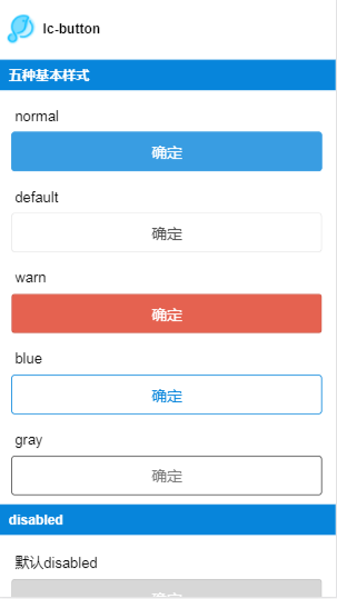
<title title="lc-button"></title>
<category title="五种基本样式"></category>
<div class="button-list">
<text class="button-text">normal</text>
<lc-button text="确定"
type="normal"
@LcButtonClicked="LcButtonClicked"></lc-button>
<text class="button-text">default</text>
<lc-button text="确定"
type="default"
@LcButtonClicked="LcButtonClicked"></lc-button>
<text class="button-text">warn</text>
<lc-button text="确定"
type="warn"
@LcButtonClicked="LcButtonClicked"></lc-button>
<text class="button-text">blue</text>
<lc-button text="确定"
type="blue"
@LcButtonClicked="LcButtonClicked"></lc-button>
<text class="button-text">gray</text>
<lc-button text="确定"
type="gray"
@LcButtonClicked="LcButtonClicked"></lc-button>
</div>
<category title="disabled"></category>
<div class="button-list">
<text class="button-text">默认disabled</text>
<lc-button text="确定"
:disabled="true"
@LcButtonClicked="LcButtonClicked"></lc-button>
<text class="button-text">type为default的disabled</text>
<lc-button text="确定"
type="default"
:disabled="true"
@LcButtonClicked="LcButtonClicked"></lc-button>
</div>
<category title="自定义样式"></category>
<lc-cell :has-top-border="false" :has-bottom-border="false" label="按钮的文字">
<input class="input"
slot="value"
placeholder="文字"
v-model="text"
@input="text=$event.value"/>
</lc-cell>
<lc-cell :has-top-border="false" label="是否禁用">
<switch :checked="disabled"
slot="value"
@change="disabled= !disabled"></switch>
</lc-cell>
<lc-cell :has-top-border="false" label="按钮宽度">
<input class="input"
slot="value"
placeholder="自定义样式实现, 默认宽度702px"
v-model="width"
@input="width=$event.value"/>
</lc-cell>
<lc-cell :has-top-border="false" label="按钮高度">
<input class="input"
slot="value"
placeholder="自定义样式实现, 默认高度88px"
v-model="height"
@input="height=$event.value"/>
</lc-cell>
<lc-cell :has-top-border="false" label="背景颜色">
<input class="input"
slot="value"
placeholder="自定义样式实现"
v-model="backgroundColor"
@input="backgroundColor=$event.value"/>
</lc-cell>
<lc-cell :has-top-border="false" label="文字颜色">
<input class="input"
slot="value"
placeholder="自定义样式实现"
v-model="color"
@input="color=$event.value"/>
</lc-cell>
<lc-cell :has-top-border="false" label="边框颜色">
<input class="input"
slot="value"
placeholder="自定义样式实现"
v-model="borderColor"
@input="borderColor=$event.value"/>
</lc-cell>
<lc-cell :has-top-border="false" label="边框圆角">
<input class="input"
slot="value"
placeholder="自定义样式实现,默认12px"
v-model="borderRadius"
@input="borderRadius=$event.value"/>
</lc-cell>
<div class="demo">
<lc-button :text="text"
:type="type"
:disabled="disabled"
:btn-style="btnStyle"
:text-style="textStyle"
@LcButtonClicked="LcButtonClicked"></lc-button>
</div>
</scroller>
</div>
</template>
<style scoped>
.wxc-demo {
position: absolute;
top: 0;
right: 0;
left: 0;
bottom: 0;
background-color: #fff;
}
.button-list {
padding-left: 30px;
}
.button-text {
margin-top: 40px;
margin-left: 8px;
margin-bottom: 16px;
}
.scroller {
flex: 1;
}
.demo {
align-items: center;
margin-top: 40px;
margin-bottom: 40px;
}
.input {
width: 300px;
text-align: right;
font-size: 28px;
}
</style>
<script>
import Light from 'light';
import LcButton from 'lighting-ui/packages/lc-button';
import LcCell from 'lighting-ui/packages/lc-cell';
import Title from 'lighting-ui/packages/_mods/title.vue';
import Category from 'lighting-ui/packages/_mods/category.vue';
export default {
components: { Title, Category, LcButton, LcCell },
data: () => ({
type: 'normal',
text: '按钮文字',
width: '690px',
height: '88px',
disabled: false,
backgroundColor: '#399de2',
borderColor: '#399de2',
borderRadius: '8px',
fontSize: '34px',
color: '#FFFFFF'
}),
computed: {
btnStyle () {
const { width, height, backgroundColor, borderColor, borderRadius } = this;
const customStyle = {};
if (width) {
customStyle.width = width;
}
if (height) {
customStyle.height = height;
customStyle.lineHeight = height;
}
if (backgroundColor) {
customStyle.backgroundColor = backgroundColor;
}
if (borderColor) {
customStyle.borderColor = borderColor;
customStyle.borderWidth = '1px';
customStyle.borderStyle = 'solid';
}
if (borderRadius) {
customStyle.borderRadius = borderRadius;
}
return customStyle;
},
textStyle () {
const { fontSize, color } = this;
const customStyle = {};
if (fontSize) {
customStyle.fontSize = fontSize;
}
if (color) {
customStyle.color = color;
}
return {
fontSize, color
}
}
},
methods: {
LcButtonClicked (e) {
const modal = Light.requireModule('modal');
const { type, disabled } = e;
modal.toast({
message: disabled ? `disabled=${disabled}` : `type=${type}`
})
}
},
mounted () {
}
}
</script>
|