<template>
<lc-tab-bar :tab-titles="tabTitles"
:tab-styles="tabStyles"
title-type="icon"
:tab-page-height="tabPageHeight"
@LcTabBarCurrentTabSelected="LcTabBarCurrentTabSelected">
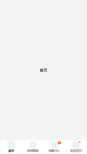
<div class="item-container" :style="contentStyle"><text>首页</text></div>
<div class="item-container" :style="contentStyle"><text>特别推荐</text></div>
<div class="item-container" :style="contentStyle"><text>消息中心</text></div>
<div class="item-container" :style="contentStyle"><text>我的主页</text></div>
</lc-tab-bar>
</template>
<style scoped>
.item-container {
width: 750px;
background-color: #f2f3f4;
align-items: center;
justify-content: center;
}
</style>
<script>
import LcTabBar from 'lighting-ui/packages/lc-tab-bar';
import Utils from 'lighting-ui/packages/utils';
import Config from 'tabbar.js'
export default {
components: { LcTabBar },
data: () => ({
tabTitles: Config.tabTitles,
tabStyles: Config.tabStyles
}),
created () {
this.tabPageHeight = Utils.env.getPageHeight();
const { tabPageHeight, tabStyles } = this;
this.contentStyle = { height: (tabPageHeight - tabStyles.height) + 'px' };
},
methods: {
LcTabBarCurrentTabSelected (e) {
const index = e.page;
}
}
};
</script>
|