<template>
<div class="wxc-demo">
<scroller class="scroller">
<title title="lc-grid-select"></title>
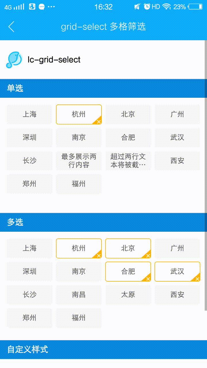
<category title="单选"></category>
<div class="demo">
<lc-grid-select
:list="testData1"
:single="true"
@select="params => onSelect('res1', params)">
</lc-grid-select>
<text class="res">{{res1}}</text>
</div>
<text class="res"></text>
<category title="多选"></category>
<div class="demo">
<lc-grid-select
:list="testData2"
:limit="5"
@overLimit="onOverLimit"
@select="params => onSelect('res2', params)">
</lc-grid-select>
<text class="res">{{res2}}</text>
</div>
<category title="自定义样式"></category>
<div class="demo">
<lc-grid-select
:single="true"
:cols="5"
:customStyles="customStyles"
:list="testData3"
@select="params => onSelect('res3', params)">
</lc-grid-select>
<text class="res">{{res3}}</text>
</div>
</scroller>
</div>
</template>
<style scoped>
.wxc-demo {
position: absolute;
top: 0;
bottom: 0;
left: 0;
right: 0;
padding-bottom: 24px;
background-color: #fff;
}
.scroller {
flex: 1;
}
.demo {
padding-top: 24px;
padding-right: 24px;
padding-left: 24px;
}
.res {
margin-top: 24px;
color: #666666;
font-size: 26px;
line-height: 36px;
}
</style>
<script>
import LcGridSelect from 'lighting-ui/packages/lc-grid-select';
import Title from 'lighting-ui/packages/_mods/title.vue';
import Category from 'lighting-ui/packages/_mods/category.vue';
import Light from 'light';
const modal = Light.requireModule('modal');
export default {
components: { Title, Category, LcGridSelect },
data: () => ({
res1: '',
res2: '',
res3: '',
testData1: [
{
'title': '上海'
},
{
'title': '杭州',
'checked': true
},
{
'title': '北京'
},
{
'title': '广州'
},
{
'title': '深圳'
},
{
'title': '南京'
},
{
'title': '合肥'
},
{
'title': '武汉'
},
{
'title': '长沙'
},
{
'title': '最多展示两行内容'
},
{
'title': '超过两行文本将被截断展示'
},
{
'title': '西安'
},
{
'title': '郑州'
},
{
'title': '福州'
}
],
testData2: [
{
'title': '上海'
},
{
'title': '杭州',
'checked': true
},
{
'title': '北京',
'checked': true
},
{
'title': '广州'
},
{
'title': '深圳'
},
{
'title': '南京'
},
{
'title': '合肥',
'checked': true
},
{
'title': '武汉',
'checked': true
},
{
'title': '长沙'
},
{
'title': '南昌'
},
{
'title': '太原'
},
{
'title': '西安'
},
{
'title': '郑州'
},
{
'title': '福州'
}
],
testData3: [
{
'title': '上海'
},
{
'title': '杭州',
'checked': true
},
{
'title': '北京'
},
{
'title': '广州'
},
{
'title': '深圳'
},
{
'title': '南京'
},
{
'title': '合肥'
},
{
'title': '武汉'
},
{
'title': '长沙'
},
{
'title': '南昌'
},
{
'title': '太原'
},
{
'title': '西安'
},
{
'title': '郑州'
},
{
'title': '福州'
}
],
customStyles: {
lineSpacing: '14px',
width: '120px',
height: '50px',
icon: '',
color: '#333',
checkedColor: '#fff',
disabledColor: '#eee',
borderColor: '#666',
checkedBorderColor: '#ffb200',
backgroundColor: '#fff',
checkedBackgroundColor: '#ffb200'
}
}),
methods: {
onSelect (res, { selectIndex, checked, checkedList }) {
Light.Vue.set(this, res, `本次选择的index:${selectIndex}\n是否选中:${checked
? '是'
: '否'}\n选中列表:${checkedList.map(item => item.title).join(',')}`);
},
onOverLimit (limit) {
modal.toast({
message: `最多选择${limit}个`,
duration: 0.8
});
}
}
}
</script>
|