
# swiper
滑块视图容器。其中只可放置swiper-item组件,否则会导致未定义的行为。
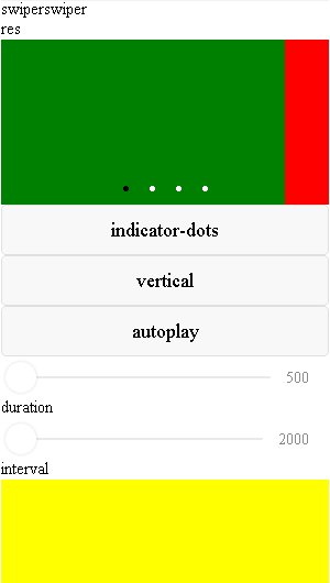
# 效果展示
# 示例代码
# WXML
<view class="page">
    <view class="page__hd">
        <text class="page__title">swiper</text>
        <text class="page__desc">swiper</text>
    </view>
    <view class="page__bd">
        <view class="section section_gap swiper">
            <view>{{res}}</view>
            <swiper indicator-dots="{{indicatorDots}}" indicator-active-color="{{indicatorActiveColor}}" indicator-color="{{indicatorColor}}" vertical="{{vertical}}"
                    autoplay="{{autoplay}}" interval="{{interval}}" duration="{{duration}}"
                    previous-margin="40px" next-margin="40px" bindchange="onChange">
                <block wx:for-items="{{background}}">
                    <swiper-item previous-margin="0" next-margin="40px">
                        <view class="swiper-item bc_{{item}}"></view>
                    </swiper-item>
                </block>
            </swiper>
        </view>
        <view class="btn-area">
            <button type="default" bindtap="changeIndicatorDots">indicator-dots</button>
            <button type="default" bindtap="changeVertical">{{vertical?'horizontal':'vertical'}}</button>
            <button type="default" bindtap="changeAutoplay">autoplay</button>
        </view>
        <slider bindchange="durationChange" value="{{duration}}" show-value min="500" max="2000"/>
        <view class="section__title">duration</view>
        <slider bindchange="intervalChange" value="{{interval}}" show-value min="2000" max="10000"/>
        <view class="section__title">interval</view>
    </view>

    <swiper  easing-function="linear" indicator-color="#000" indicator-active-color="#fff" interval="1000" duration="1000"  circular autoplay  indicator-dots  current="2">
        <block wx:for-items="{{background}}">
            <swiper-item>
                <view class="swiper-item bc_{{item}}"></view>
            </swiper-item>
        </block>
    </swiper>
</view>
# JS
Page({
    data: {
        background: ['green', 'red', 'yellow', 'red'],
        indicatorDots: true,
        indicatorColor:"#ffffff",
        indicatorActiveColor:"#000000",
        previousMargin:"30px",
        nextMargin:"30px",
        vertical: false,
        autoplay: false,
        interval: 3000,
        duration: 1000,
        res: 'res'
    },
    changeIndicatorDots: function (e) {
        this.setData({
            indicatorDots: !this.data.indicatorDots
        })
    },
    changeVertical: function (e) {
        this.setData({
            vertical: !this.data.vertical
        })
    },
    changeAutoplay: function (e) {
        this.setData({
            autoplay: !this.data.autoplay
        })
    },
    intervalChange: function (e) {
        this.setData({
            interval: e.detail.value
        })
    },
    durationChange: function (e) {
        this.setData({
            duration: e.detail.value
        })
    },
    onChange(e) {
        this.setData({
            res: JSON.stringify(e.detail)
        })
        console.log(e.detail)
    }
})
# WXSS
.swiper-item{
    display: block;
    height: 150px;
}
.bc_green{ background: green;}
.bc_red{ background: red;}
.bc_yellow{ background: yellow;}
# API
| 属性 | 类型 | 默认值 | 必填 | 说明 |
|---|---|---|---|---|
| indicator-dots | boolean | false | 否 | 是否显示面板指示点 |
| indicator-color | color | rgba(0, 0, 0, .3) | 否 | 指示点颜色 |
| indicator-active-color | color | #000000 | 否 | 当前选中的指示点颜色 |
| autoplay | boolean | false | 否 | 是否自动切换 |
| current | number | 0 | 否 | 当前所在滑块的 index |
| interval | number | 5000 | 否 | 自动切换时间间隔 |
| duration | number | 500 | 否 | 滑动动画时长 |
| circular | boolean | false | 否 | 是否采用衔接滑动 |
| vertical | boolean | false | 否 | 滑动方向是否为纵向 |
| previous-margin | string | "0px" | 否 | 前边距,可用于露出前一项的一小部分,接受 px |
| next-margin | string | "0px" | 否 | 后边距,可用于露出后一项的一小部分,接受 px |
| bindchange | eventhandle | 否 | current 改变时会触发 change 事件,event.detail = {current} |
- previous-margin、next-margin需配合swiper-item使用,设置在swiper-item上生效
- current改变时会切换至所在滑块。若两次设置相同的current,则不会产生切换